The Evolution of Food Photography: A Blogger’s Journey to Capturing Delicious Dishes

When I first embarked on this blogging adventure, my primary motivation was a profound love for cooking and an eagerness to share my culinary explorations with the world, particularly with fellow college students. What I hadn’t anticipated, however, was the immense skill, strategic thought, and sheer effort required to produce truly captivating food photography. Looking back at my earliest posts, it’s clear that many of my photos suffered from bizarre lighting, awkward compositions, and an overall lack of visual appeal. I simply didn’t possess the knowledge or tools to make my delicious creations look as good as they tasted.
While I’m still on a continuous learning curve and far from achieving perfection, consistent practice and dedicated effort have brought about a remarkable transformation. Having now been immersed in the world of blogging for almost two years, the contrast between my initial attempts and my current photography is nothing short of incredible. This significant improvement hasn’t happened in a vacuum; a few key circumstantial changes have played a pivotal role in enabling me to capture far better photos, enhancing the overall quality and professionalism of my food blog.
Key Shifts That Transformed My Food Photography
1. Life Beyond College: Embracing Natural Light
One of the most impactful changes stemmed from leaving my student days behind. During my college years, a significant amount of my cooking happened late at night, often fueled by procrastination. This inevitably meant I was taking photos under harsh, artificial kitchen lights, which cast an unflattering yellow-green hue over everything. The results were consistently unappetizing and did a disservice to the dishes I was so passionate about creating.
Now, with a more flexible schedule, I’ve learned to adapt. If inspiration strikes late at night, I simply make a conscious effort to set aside a portion of my culinary creation specifically for photography the following morning. This simple adjustment ensures that my food can be photographed under the optimal conditions of natural light. For many of my late-night kitchen adventures, especially baked goods, this strategy is perfectly feasible and has proven to be a game-changer for the warmth and authenticity of my recipe visuals.
2. The DSLR Difference: A Game-Changer for Clarity and Control
The second, and arguably most transformative, factor in my food photography evolution was the incredible gift of a DSLR camera from my mom last Christmas. There’s simply no denying it: while you can certainly capture decent images with a point-and-shoot camera or even a smartphone, you won’t unlock the full potential of food photography until you have a DSLR. Many will assert that good pictures are achievable with any camera, and that’s true to an extent. However, the level of detail, control, and professional quality attainable with a DSLR is in a league of its own.
Currently, I’m shooting with a Nikon D200, paired with a versatile 50mm f/1.8D lens. This combination has revolutionized my ability to capture food. The wider aperture of the 50mm lens (f/1.8) allows for a beautiful, creamy background blur (bokeh), making the food truly pop and drawing the viewer’s eye directly to the main subject. Furthermore, the DSLR’s larger sensor handles low-light conditions much better, reducing noise and preserving detail, while offering extensive manual controls over ISO, shutter speed, and aperture. These features provide unparalleled creative freedom, allowing me to precisely tailor each shot to highlight the textures, colors, and overall appeal of the food. It’s safe to say, life through the lens of a DSLR is significantly better for a food blogger.
Visual Case Studies: Before & After Food Photography
This section is a personal favorite for me, as I find these visual comparisons absolutely fascinating. I hope you enjoy this detailed breakdown of my photography journey as much as I do!
Muffin Comparison: From Grainy to Glorious

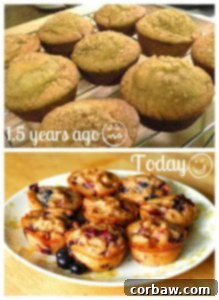
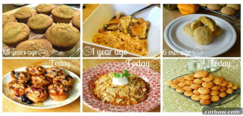
Oy. The top picture, showcasing some banana bread, hails from a post I wrote just a few months after I started blogging. It represents the very essence of beginner blunders. In stark contrast, the bottom picture, featuring delectable beer berry muffins, was taken just three months ago. Let’s meticulously count the myriad ways the top picture falls short:
- Lack of Resolution and Graininess: This image was captured with a cell phone, resulting in a small file size. When scaled up for web viewing, it becomes noticeably grainy and pixelated, diminishing any potential appeal.
- Detrimental Artificial Lighting: Taken exclusively under a standard kitchen light bulb, without any natural light, the photo suffers from an awful yellow cast. The muffins, inexplicably, have a sickly green hue. This artificial lighting flattens the image, creating harsh shadows and uninviting colors that make the food look anything but appetizing.
- Awkward and Tight Composition: While not entirely dreadful, the composition is certainly not good. The muffins are presented at an unusual angle, making the shot feel cramped and confined. There’s little room for the eye to breathe, and the perspective does not flatter the subject.
- Visual Blandness and Distracting Background: The picture lacks any real interest. The dominant colors are muted browns and neutrals, further compounded by that strange green tint. Furthermore, vague, undefined “weird stuff” can be vaguely discerned in the background, drawing attention away from the main subject rather than enhancing it. Overall, it’s an unfortunately awful representation of what was likely a delicious baked good.
The bottom picture, however, is a testament to improvement and photographic principles. It is genuinely pretty and effectively communicates the deliciousness of the muffins. I want to reach through the screen and grab one! Let’s highlight the elements that make this bottom picture truly lovely:
- Embrace of Natural Light: This is, without a doubt, the single most crucial lesson I’ve absorbed over the past couple of years: always, always, without compromise, shoot in natural light! It creates a profound difference in the quality of your photos. Because it was taken in natural light, the image is inherently brighter, clearer, and the colors of the muffins are rendered much more accurately, appearing vibrant and appealing. Natural light adds depth and dimension that artificial light simply cannot replicate.
- Effective and Clear Composition: The composition here works beautifully. Although it’s a simple shot of muffins on a plate, the arrangement is clear and inviting. The viewer can instantly discern what they are looking at, and all elements of the muffins are visible and well-defined, creating a sense of order and focus.
- Thoughtful Setup and Styling: The setup is well-considered. The choice of a mostly white plate, despite its subtle floral detail, serves a vital purpose. It allows the rich colors and textures of the muffins to stand out prominently, reflecting their true, appetizing coloring without interference. This simple styling choice elevates the entire image, ensuring the food remains the star of the show.
Mexican Casserole: From Unidentifiable Mess to Appealing Dish

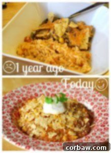
Both of these photos depict my Mexican Casserole dish. The top image immediately evokes a “yikes” reaction. I certainly do not want to eat the unappetizing mess shown in that picture. Let’s dissect its shortcomings in detail:
- Lack of Clarity and Poor Composition: “What the heck is it?” is the first question that comes to mind. I can vaguely identify rice and chips, but the overall dish is a jumbled, unidentifiable heap. The composition is dull and excessively tight, failing to provide any visual context or appealing presentation. It’s hard to tell what’s actually being offered.
- Dreadful Lighting Again: Once more, the culprit is the abysmal kitchen lighting. The artificial light has given the food a nauseating yellow cast, making it appear greasy, old, and utterly unappetizing. Proper lighting is fundamental, and its absence here truly ruins the visual experience.
- Utterly Boring Presentation: There is absolutely nothing visually engaging about this photo. It features a plain white bowl, a spoon carelessly placed within, and the corner of a hot pad poking into the background. There’s no styling, no visual interest, just a flat, uninspiring image. Boooo.
- Distorted Focus and Lens Issues: Somehow, the picture appears warped, likely due to the limitations of the point-and-shoot camera’s lens. To make matters worse, the focus is predominantly on the rim of the bowl rather than the actual food, a critical error in food photography that diminishes the subject’s importance.
However, the bottom picture is a complete turnaround – it’s beautifully composed and genuinely appealing!
- Brilliant Natural Light: It is, once again, shot in glorious natural light! This translates to a bright, crisp, white, and clear image that allows the true colors of the ingredients to shine through. Natural light elevates the food, making it look fresh and inviting.
- Enhanced Visual Interest and Styling: Visual interest is skillfully created through several elements. The subtle pattern of the bowl adds texture without overpowering the dish. The creamy swirl of sour cream and the fresh, vibrant green of the cilantro provide appealing contrasts in color and texture. Simply put, it’s pretty and meticulously styled.
- Identifiable Components and Appeal: While it might be challenging to fully identify every single ingredient in a casserole from a single photo, this shot makes it easy to pick out key components: the fresh dollop of sour cream, the bright cilantro, crunchy chips, melted cheese, rich refried beans, and corn. It feels safe, appealing, and clearly showcases the delicious elements within.
- Balanced and Symmetrical Composition: The composition is thoughtfully symmetrical, drawing the eye directly to the center of the food. The focus is squarely on the culinary creation itself, rather than being distracted by the bowl or any other ancillary elements in the frame. This ensures the food remains the undisputed star of the photograph.
Snickerdoodles: Refinement in Lighting and Styling

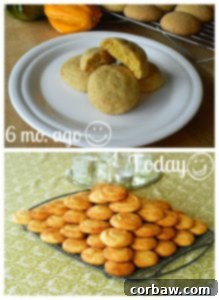
At this specific juncture in my photography evolution, I was incredibly close to consistently achieving the quality I desired. The top picture features pumpkin snickerdoodles I baked last winter, while the bottom showcases regular snickerdoodles prepared for a 5k event this spring. The progress here is about refinement.
Analyzing the top picture:
- Insufficient Natural Light: While it was (finally!) shot in natural light, the light source was either too weak or not properly utilized, resulting in a picture that is too dark. There are prominent, heavy shadows that obscure details, and my preference is always for photos that are bright, airy, and clear, allowing the food to sparkle.
- Missed Opportunity with Props: I did attempt to introduce visual interest with gourds, which was a step in the right direction. However, the composition isn’t quite right; the gourds are awkwardly cut out of the frame, making them difficult to identify clearly. They could have been positioned more strategically to effectively create visual interest and add appealing pops of color without distracting from the main subject.
- Excessive Empty Plate Space: There’s simply too much empty plate visible in the picture. This creates a sense of emptiness and leaves a lot of uninteresting white space. I should have used more cookies to make the frame feel fuller and more abundant, as too much barren white space can make a food photo appear uninspired and uninviting.
Now, let’s appreciate the improvements in the bottom picture:
- Bright, Clear Natural Light with Minimal Shadows: This photo benefits from bright, natural light that is beautifully diffused, resulting in significantly fewer harsh shadows. The cookies are illuminated clearly, highlighting their texture and warm cinnamon color, which is exactly the vibrant and inviting look I strive for.
- Strategic Use of Pattern and Color: Snickerdoodles, being predominantly brown, can sometimes appear a little visually plain on their own. To counteract this and make the photo more visually engaging, I introduced a vibrant green, patterned tablecloth. This simple addition breaks up the monotony of brown and neutral tones, introducing color and texture that complements the cookies without overshadowing them. It transforms the image from a world of browns into something much more dynamic.
- Integrated Centerpiece for Visual Interest: The inclusion of a small centerpiece (perhaps a flower or a small decorative element) creates additional visual interest. Crucially, it does so without pulling attention away from the snickerdoodles themselves, maintaining their status as the primary focus of the picture.
- Balanced and Inclusive Composition: The composition is excellent. The shot is taken far enough away to comfortably include all the food elements, providing a generous view without feeling cramped. This broader perspective allows the viewer to appreciate the overall spread.
- Abundance for Aesthetic Appeal: The baking rack is completely full of cookies, which instantly makes the photo more inviting and fun to look at. An abundance of food often signifies deliciousness and generosity, making the image much more appealing and enticing to the viewer.
How About You? Sharing Insights and Goals
This journey has been incredibly rewarding, and I’m always eager to learn from others in the community. Good food photography, like cooking itself, is an ongoing art form. I’d love to hear your thoughts and experiences:
- Are you a food blogger? What invaluable lessons have you gleaned during your time on the interwebs regarding the art and science of photography?
- Are you a professional or amateur photographer? What other specific advice or advanced techniques do you have to offer aspiring food bloggers looking to elevate their visual content?
- What specific food or photography goals have you set for yourself in the coming months or year? How do you plan to achieve them?
- What are some creative techniques, props, or setups that you routinely use to make your food pictures more engaging and visually compelling?
In conclusion, I genuinely hope you’ve enjoyed this detailed tour through my evolving blogging adventure as much as I have enjoyed documenting it! There is an endless wealth of knowledge to acquire in the realm of food blogging, whether it pertains to mastering new recipes, refining photography skills, or perfecting the art of plating and food styling. The continuous learning process is what keeps this passion alive, and I eagerly anticipate seeing just how far my skills will have progressed in yet another year!
